Monday, July 25, 2011

Selling the Sales

Sales. An integral part in every retailers calendar, so why so often do they become an excuse for some stores to leave their windows baron and their merchandise shabby?

The word SALE plastered across a window no longer has the same impact as it once did, largely because at least half a dozen retailers will be on sale at any one time in the year. So that sense of urgency, that excitement of an 'event' has less impact. That coupled with the rise of online shopping where Australians have become wise to the fact they can buy for less over the internet has again diluted the impact of our traditional sale.

However, markdowns are a fact of retail life and getting ‘clean’ in preparation for new stock is as much part of the calendar as anything else. The way retailers approach the matter of clearance, however, varies widely, and for some – think Harrods – it is a highly marketable event just like any other promotion. And it's only once a year so still has that prestige status.

So what's the best way to present a mark-down sale? How can we bring innovation to our windows and visual merchandising? Here are just a few examples of how some stores skin that cat:

Desigual
Desigual, parades a mass of Sale red T-shirts as overhead banners.

Also using giant T-shirts in the windows bearing an “I heart 50% off” slogan – in keeping with the brand’s contemporary feel.

A high-impact LED screen, bearing the -50% promotion as well as showcasing markdowns adds energy to the fascia, again making it more noticeable than those of neighbouring stores.


Radley UK
Radley are a UK bag retailer. An extension of this means that when it comes to Sale time it’s an idea to put giant Sale shopping bags in the window – coloured red, naturally.

This is an incredibly simple and low-cost way of getting the message out there and, when coupled with a relatively discreet decal on the window stating ‘Up to 60% off’, it was little surprise it gets noticed.


Replay
Italian denim brand Replay can normally be relied on to come up with something interesting at Sale time and this window scheme confirms that it understands how to create a stir.

Long, unfurled till rolls are suspended from wooden spools with the word SALE printed in red between the numbers of imaginary items that have been purchased.

This is one of the more original ways of telling shoppers that there are bargains at that store, although whether shoppers will find this sufficiently compelling to step inside or whether it proves to be merely an interesting arty distraction is a moot point.


Uniqlo
What can only be called a Sale tower of power describes what has been done by Uniqlo to grab the gaze of passing shoppers. The massively high windows either side of the entrance are divided into a series of dark rooms with nothing in them other than a male mannequin, a female mannequin and a sale banner, the latter composed in a very traditional manner.


Suit Supply
This is a modest sale treatment, but is virtually unmissable. Suit Supply has taken a fairly low profile clothing category and turned in into a mass-market fashion event. The somewhat retro 1950s signage that it has placed at the bottom of its window keeps faith with its quirky visual merchandising approach.


Nike 6.0 Pops up


Pop-up stores tend to be fairly ephemeral affairs, quite frequently here today and gone tomorrow and this one, from Nike, in Mondello, Sicily, is no exception with a lifespan of just two months.

Designed in-house with the collaboration of Over The Rainbow, an Italian consultancy, and built by New Store Europe, this does, however, have a level of detail that marks it out as somewhat different from the normal rough and ready pop-up world.

Covering an area of about 1,076 sq ft, the store’s structure is composed of overlapping multilayer panels and a concealed hooking system for hangers and shelves.


The store is intended to highlight Nike 6.0, a new brand of clothing from the sportswear brand and, as well as the non-standard approach to construction, it also carries several video walls and hand-painted graphics.


The effect is of a deconstructed surf shack where the wooden planks are almost on the point of falling to the floor, but have somehow been frozen in time.

There is not actually a huge amount of stock in this relatively modest space, a wall of sneakers and some forward-hung T-shirts, but the effect is to focus attention on what is actually there.


The really good bit about this, however, is that it is in Mondello, the chi-chi beach resort where Palermo’s affluent head for a day out by the seaside.


If an excuse were needed to go and check out some unusual retail design while enjoying a few good meals and some decent scenery, then this must be it. You’ll have to be quick though as it is scheduled to be dismantled by August 3.

John Ryan Retail Week

Friday, July 22, 2011

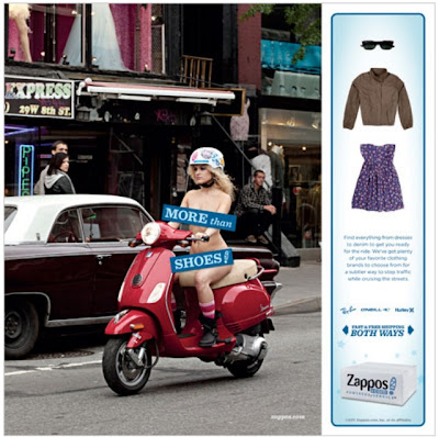
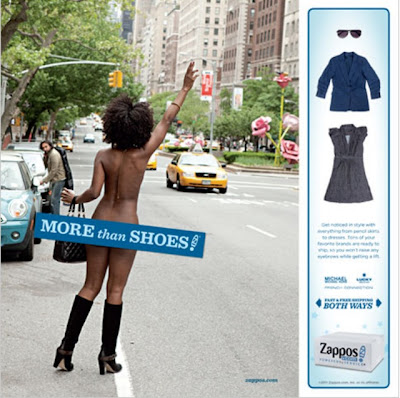
Zappos Ads encourage users to Dress Naked Women

Zappos has launched an ad campaign that expands the definition of “interactive” — by using QR codes to let consumers dress naked models featured in print ads.

The ads, breaking later this month, seek to drive home the point that Zappos offers “more than shoes,” so that phrase is splashed across the otherwise nude women’s nether regions. The QR codes then lead to a website with a video showing what happened to the women after the ad. Consumers can choose an outfit for the women and go to Zappos to buy it.

The ads feature just women for now, but will add a male character at the end of the month, according to The New York Times.

The campaign is a departure from Zappos’s previous creative approach, which featured Crank Yankers-like puppet dramatizations of Zappos sales reps handing customers’ inquiries.

Note: The ads below don’t contain the QR codes. A rep for Mullen, the ad agency that created the campaign, says they will be added when the ads go live.


Todd Wasserman - Mashable

Friday, July 15, 2011

M&M's opens new retail store in Leicester Square, London

Europe’s first M&M’s World has opened in Leicester Square, but is this about retailing or brand building?


Imagine a store where the staff are lined up inside the entrance as the doors open and whoop and cheer as the first customers make their way in. Could be pretty frightening if you weren’t expecting it, or you might be glancing over your shoulder to try and work out what the fuss is about.

This was the prospect for shoppers at the recently opened M&M store on London’s Leicester Square last week, and although some of those entering looked a little bemused, the effect was greeted with a general sense of good humour. Indeed, in spite of a fairly average July morning last week, there were a few souls who had been waiting some time for the chance to get inside.

But how do you go about turning some, admittedly, brightly coloured sweets into a retail experience that will fill a space this size?

The answer would seem to involve giving shoppers choice. There are 22 different colours of M&M’s and this is a quintessentially North American brand. A lot can therefore be done to ring the changes as far as giving shoppers opportunities to customise their selections in-store, but probably the first task is to cement the link between M&M’s and London.

Leicester Square actually has relatively little to do with everyday London, other than as a destination for blockbuster premieres. For the most part, this is tourist central and according to Mars, 27 million people pass through the area every year.

What they are in search of is a little piece of Britishness and therefore the decision to turn the M&M’s logo into a Union-Jacked lightbox and place this in a prominent position on the window line seems canny.

Walk through the doors and to gain access to the ground floor, you have to pass through the side of a double-decker London bus. It is odd that with Tower Bridge, the Gherkin and the London Eye all established as icons for the UK capital, the red double-decker continues to serve as shorthand for it, but M&M’s is only following the path pursued by Hamleys a few years ago. Once through this, the ground floor is largely a decompression zone prior to the main events, which can be found in the two basement levels.

At the back of the floor, one of the many life size anthropomorphic sweet ‘characters’ is seated in what looks like a mock-up of an open top Aston Martin. And for those for whom this is insufficient, there are people dressed as individual M&M’s who wander the shop – it is very American and the influence of Disney is never far away. But when the number of UK people who board planes to spend a week in Orlando is considered, there is a ready market for this kind of thing.

Heading down to the lower basement, via the impressive spiral staircase that gives views up through the whole of the store and lets a high level of natural daylight into the shop, you enter the realm of the M&M’s lab. This is where shoppers can get a technician in a glass-fronted, sealed room to mix particular bespoke sweets on command. This may be simple stuff, but it is about theatre and personalising the offer for each visitor. More life-size M&M’s here too – standing in a row, catwalk style.

All in all, if you like M&M’s then this will be a very exciting experience and even if you’re not interested, it’s easy to see how shoppers, locals and tourists alike will be caught up in this.

It is quite hard, given the relatively low unit price (although there is a small roller-coaster sculpture filled with M&M characters on sale at £775), to see how this show pony will ever come close to break even, but there again, as an advert for the brand this is strong and when you consider nearby Nike Town and even Bose, there is good form for the approach. It’s an interesting addition to the central London retail landscape.

John Ryan for Retail Week