Showing posts with label Visual merchandising. Show all posts

Monday, July 25, 2011

Selling the Sales

Sales. An integral part in every retailers calendar, so why so often do they become an excuse for some stores to leave their windows baron and their merchandise shabby?

The word SALE plastered across a window no longer has the same impact as it once did, largely because at least half a dozen retailers will be on sale at any one time in the year. So that sense of urgency, that excitement of an 'event' has less impact. That coupled with the rise of online shopping where Australians have become wise to the fact they can buy for less over the internet has again diluted the impact of our traditional sale.

However, markdowns are a fact of retail life and getting ‘clean’ in preparation for new stock is as much part of the calendar as anything else. The way retailers approach the matter of clearance, however, varies widely, and for some – think Harrods – it is a highly marketable event just like any other promotion. And it's only once a year so still has that prestige status.

So what's the best way to present a mark-down sale? How can we bring innovation to our windows and visual merchandising? Here are just a few examples of how some stores skin that cat:

Desigual
Desigual, parades a mass of Sale red T-shirts as overhead banners.

Also using giant T-shirts in the windows bearing an “I heart 50% off” slogan – in keeping with the brand’s contemporary feel.

A high-impact LED screen, bearing the -50% promotion as well as showcasing markdowns adds energy to the fascia, again making it more noticeable than those of neighbouring stores.


Radley UK
Radley are a UK bag retailer. An extension of this means that when it comes to Sale time it’s an idea to put giant Sale shopping bags in the window – coloured red, naturally.

This is an incredibly simple and low-cost way of getting the message out there and, when coupled with a relatively discreet decal on the window stating ‘Up to 60% off’, it was little surprise it gets noticed.


Replay
Italian denim brand Replay can normally be relied on to come up with something interesting at Sale time and this window scheme confirms that it understands how to create a stir.

Long, unfurled till rolls are suspended from wooden spools with the word SALE printed in red between the numbers of imaginary items that have been purchased.

This is one of the more original ways of telling shoppers that there are bargains at that store, although whether shoppers will find this sufficiently compelling to step inside or whether it proves to be merely an interesting arty distraction is a moot point.


Uniqlo
What can only be called a Sale tower of power describes what has been done by Uniqlo to grab the gaze of passing shoppers. The massively high windows either side of the entrance are divided into a series of dark rooms with nothing in them other than a male mannequin, a female mannequin and a sale banner, the latter composed in a very traditional manner.


Suit Supply
This is a modest sale treatment, but is virtually unmissable. Suit Supply has taken a fairly low profile clothing category and turned in into a mass-market fashion event. The somewhat retro 1950s signage that it has placed at the bottom of its window keeps faith with its quirky visual merchandising approach.


Thursday, June 30, 2011

Great VM needn't cost a bomb


Sometimes it really is tempting to believe that the best visual merchandising and, perforce, the best shops, tend to be the outcome of large cheques being signed.

Sometimes it really is tempting to believe that the best visual merchandising and, perforce, the best shops, tend to be the outcome of large cheques being signed. The pop-up store revolution notwithstanding, it is pretty easy to see where large amounts of money have been lavished on a project and at the very least a degree of consideration is likely to be the outcome.

That said, it is creativity and imagination that remain the real trump cards when it comes to stores and spaces that will capture the shopper’s attention. This example, a small area in the modish Parisian department-cum-fashion store Merci serves as a case in point. The store has given Australian ethical skincare and beauty brand Aesop a small corner of the shop in which to create a shop-in-shop that will stay in place for a month and a half (it opened on December 17). And in essence, the design is astonishingly simple. Aesop has placed 4,500 plain cardboard boxes, each of which has the brand’s name printed on it in a bold black font, placed within a quasi-fishing net strung across the ceiling and allowed to droop. Beneath this, more of the same boxes have been stacked on the floor to create a mid-shop fixture on which the various lotions and unguents are displayed. The products are far smaller than the display, but they are nonetheless highlighted by the naked light bulb pendants suspended directly over them.

This may be a low-cost way of creating style but it was receiving a distinctly unfair quota of shopper attention over Christmas - proof that a clear vision and slick execution will always be more effective than a bottomless pit of cash.

Retail Week

Tuesday, May 24, 2011

Summer in Manchester

As Australia heads into winter, retailers and their ad agencies are undoubtably working on the next summer campaign and dare I say it, planning Christmas. A good time therefore to look to our northern hemisphere comrades and take a look at some of the UK's summer campaigns in Manchester.

Primark, Market Street


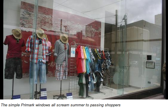
On a grey day in the heart of Manchester, Primark shone out as the retailer banking everything on summer. Each of its many windows had been themed to encourage Costa del Ship Canal shoppers that now would be the right time to make a budget seasonal purchase.

Messages such as ‘10 of the best sandals’, ‘Fits me to a T’ and ‘Beautiful on the beach’ seemed to be working in spite of the weather and there was nothing complex about the window displays that had been installed. Generally, this was nothing more than torsos on poles to which shorts, short-sleeve shirts and crop tops had been applied.


It was doing the trick, however, and, as usual, the area beyond the main entrance was filled with people clutching multiple Primark bags.

Ted Baker, The Trafford Centre


The thing many shoppers like about Ted Baker is its windows, which usually combine wit with a seasonal theme. The store in The Trafford Centre proved no exception, with a display featuring 3D animated, cartoon-style bees buzzing around, backed by the message ‘Let’s get ready to bumble’.

Whatever your thoughts on the quality of the pun, there was no denying that shoppers were stopping to inspect what had been done and the usual artfully contrived mish-mash of store design tropes awaited those who ventured inside.


This, along with Primark, was among the most obviously summer-themed stores in Manchester and, given the complexity of what has been done in Ted Baker, it seems reasonable to suppose that this scheme will remain in place for much of the summer.

Selfridges, Exchange Square and The Trafford Centre


Selfridges’ two Mancunian outposts are warning shoppers about the dangers of overfishing at the moment – just like the London store, where the campaign was launched by Prince Charles last week. In the two stores, ‘Project Ocean’ consists for the most part of cardboard cut-out fish, accompanied by messages suspended from the ceiling.

It is hard to miss the initiative. In The Trafford Centre, for instance, the fishes are positioned at the non-mall entrance and upstairs where the store provides ingress to the mall’s upper level.

But it feels curious in light of the fact that, as well as the fishes that can be viewed in the food halls, they have also been positioned above sundry garment areas at the top of escalators. Presumably, the notion is that even if a visit to the food hall is not on the cards, the visitor will still be made aware of what is happening in our oceans.


Project Ocean involves Selfridges teaming up with more than 20 environmental and conservation groups and runs until June 12.

Jack Wills, King Street


Given university outfitters Jack Wills’ penchant for quaint cathedral cities that have an ancient institution attached, you might not have expected to find a branch in Manchester. That said, this store is located just off St Ann’s Square in the historic heart of the city.

A strapline across the lower part of one of the windows reads ‘Summer term now in stock’ – all well and good and exactly the sort of messaging you would expect of a store premised on the notion of being governed by the vagaries of our better higher education establishments. Yet the visual merchandising team seemed to have overlooked the fact that, when visiting, the royal wedding had taken place two weeks before.

This meant that a crown and the words ‘Wills & Kate: Get your exclusive mug in store’, were still on view. Whether the choice to leave this in the window was laziness, or the effect of having bought a few too many exclusive mugs, was anybody’s guess.

The Manchester Store, The Trafford Centre


You have to admire this shop if only for the way that it pokes fun at the nearby Apple Store with a distinctly white, minimalist fit-out and T-shirts that include a black number with a plain white font bearing the legend: ‘iManc’. You could be forgiven for thinking that the bulk of the shoppers walking around The Trafford Centre might actually be from Manchester and therefore having a store dedicated to the city in which they live might spell tough trading.


That said the sense of civic pride plays second fiddle to a feeling that here is a store that offers a bit of fun that happens to be about the city. It has been in this unit for a little over a year and even the shop assistant admitted to having purchased an ‘iManc’ T-shirt. Surprisingly, it’s actually quite hard to walk past this one without taking at least a look through the door. A white ceiling raft, backed by a plain black ceiling void and plain wood flooring equates to souvenirs for the design-conscious. Good for summer stock too.

John Ryan for Retail Week

Wednesday, February 23, 2011

Rapid change VM.

So what draws customers to great VM? Bright colours? Big decals? Well maybe but more importantly customers just want to be engaged. Entertain them, give them a reason to talk to you and be innovative in your designs. Many retailers in big cities around the world change their window displays as often as every 2 weeks in an attempt to stay current, offer something new and engage their customers. But of course that comes at a huge expense. Until now. How about a new window display every 5 minutes?

I feel an awesome Visual Merchandising opportunity coming on:

Living Room from Mr.Beam on Vimeo.


Mr Beam's living room project created an unique physical 3D video mapping experience by turning a white living room into a spacious 360° projection area.

This technique allowed them to take control of all colors, patterns and textures of the furniture, wallpapers and carpet. All done with 2 projectors. Imagine that in Westfield!